Design challenge
To audit, analyze and provide user experience recommendations to a client whose website is in need of a performance boost.
Problem space
The Strawberry Mansion Learning Center is a nonprofit organization aimed at increasing literacy and providing a safe haven for learning in the unserved Northwest Philadelphia neighborhood of Strawberry Mansion. The SMLC website is integral in providing members with communications, as well as allowing current and prospective financial donors a glimpse into the organizations achievements.
The purpose of this project is to improve the site’s heuristics and functionality by providing tailored experience recommendations, thus allowing it to better serve its purpose of connecting the community.
Research
Working in a group of 3, my teammates and I began with an audit of the site’s current standing. We used Abby Covert’s Information Architecture Heuristics as a framework to conduct our audit, asking ourselves how the presentation of information on SMLC’s website measured up against the following criteria:
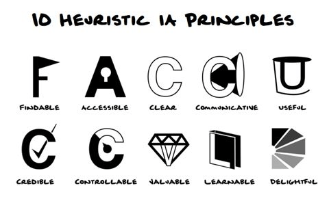
- Findable: Able to be located
- Accessible: Easily approached and/or entered
- Clear: Easily Perceptible
- Communicative: Talkative, informing, timely
- Useful: Capable of producing the desired or intended result
- Credible: Worthy of confidence, reliable
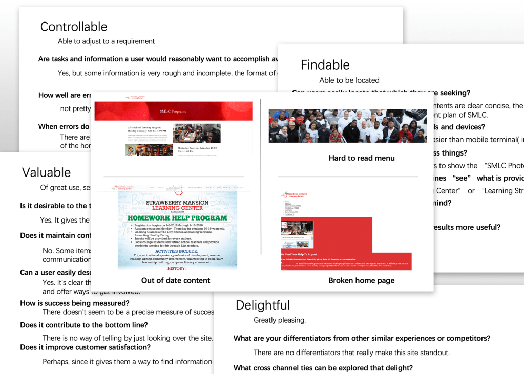
- Controllable: Able to adjust to a requirement
- Valuable: Of great use, service and importance
- Learnable: To fix in the mind, in the memory
- Delightful: Greatly pleasing
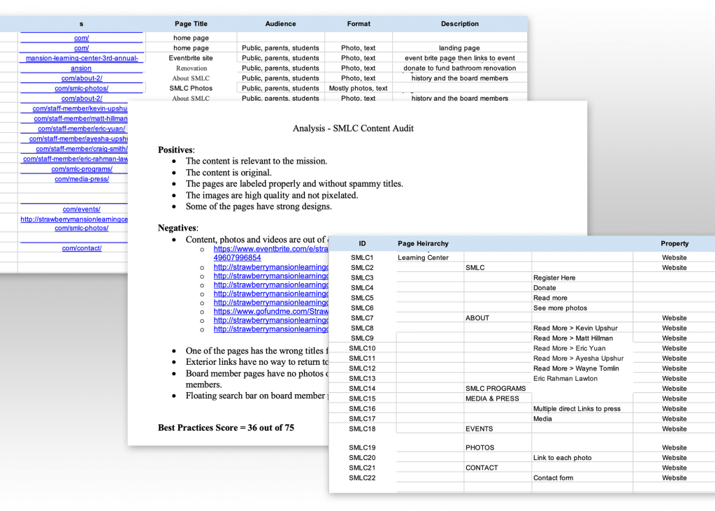
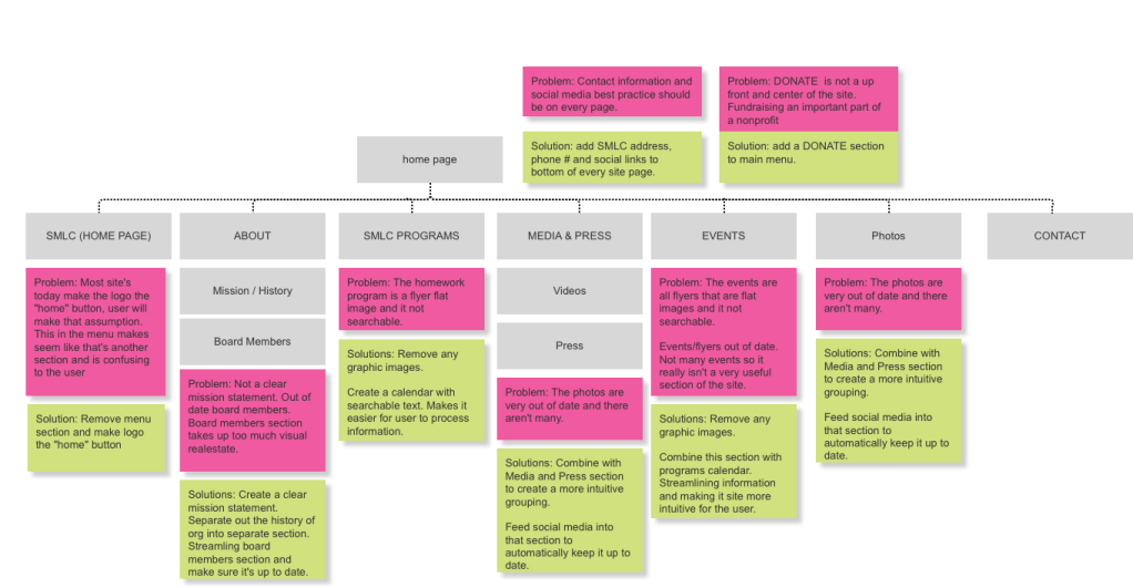
The team also conducted a content audit. In combination, these two methods were able to paint a clear picture of where the website’s strengths and weaknesses lie. We were able to identify key pain points.
Top 3 findings
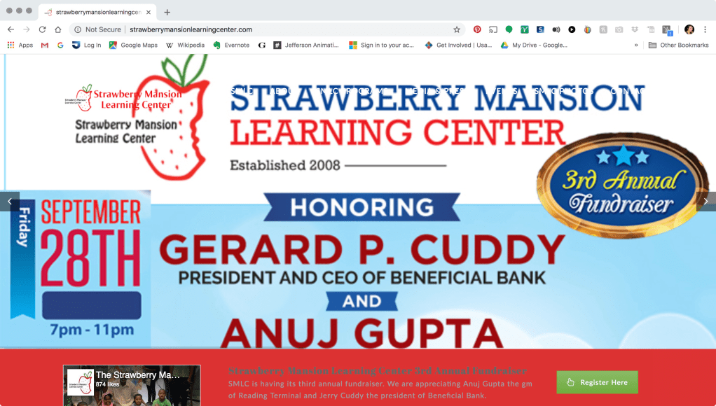
- Capable of producing the desired or intended results? Not at first – the landing page isn’t functioning properly, so it’s hard to get an understanding of where to go from there. There’s a danger of frustration or abandoning the task.
- Are the navigation options clearly labeled and is the path to task completion evident and free of distraction? No, CTA’s are hard to read because of the white text. The background colors of the banner are in competition with the color of the text.
- Is the design appropriate to the context of use and audience? The large red bar is not in line with the learning center concept. It’s almost jarring and corporate.
Design SOlution
With the information from our analysis pin-pointing the problems that need solving, we focused our work on moving towards providing meaningful solutions.
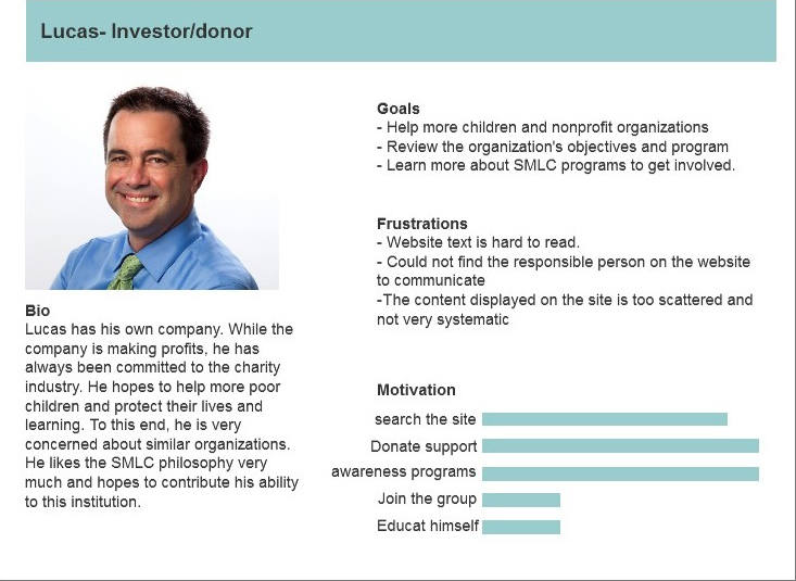
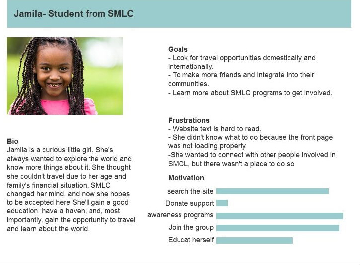
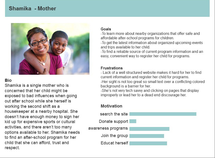
Personas
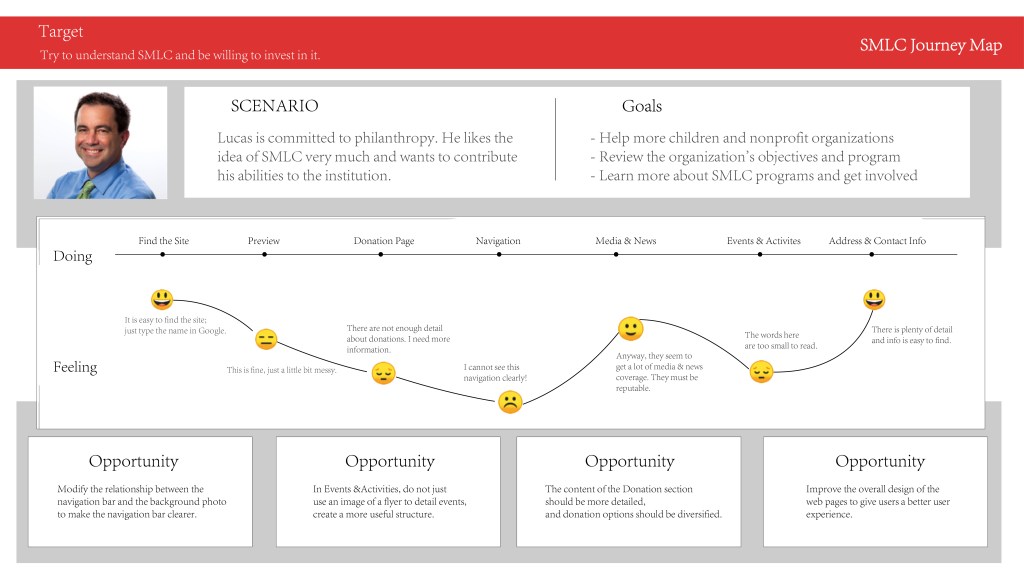
JOurney Map
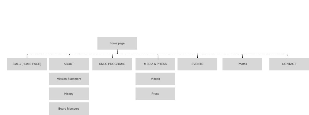
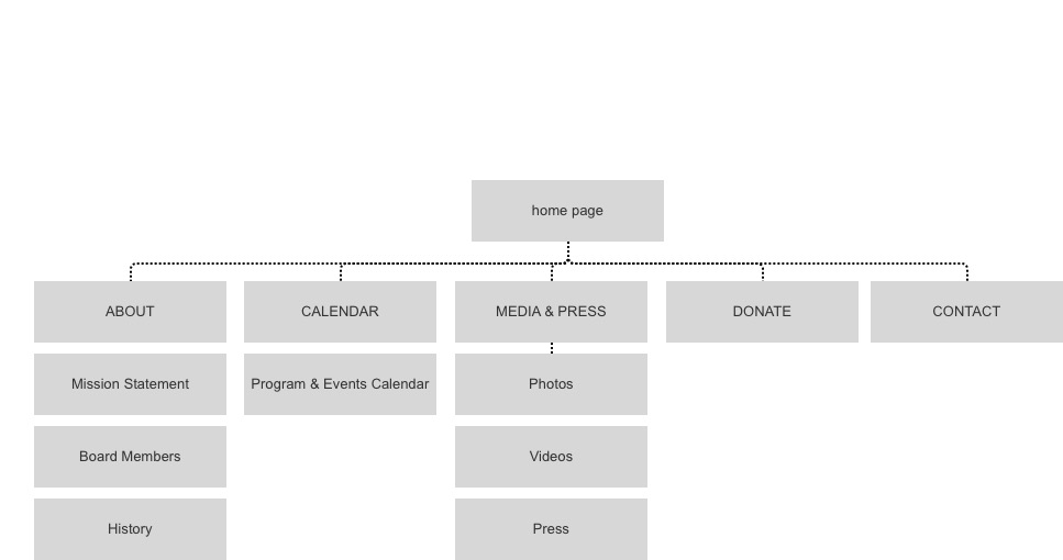
Site Map
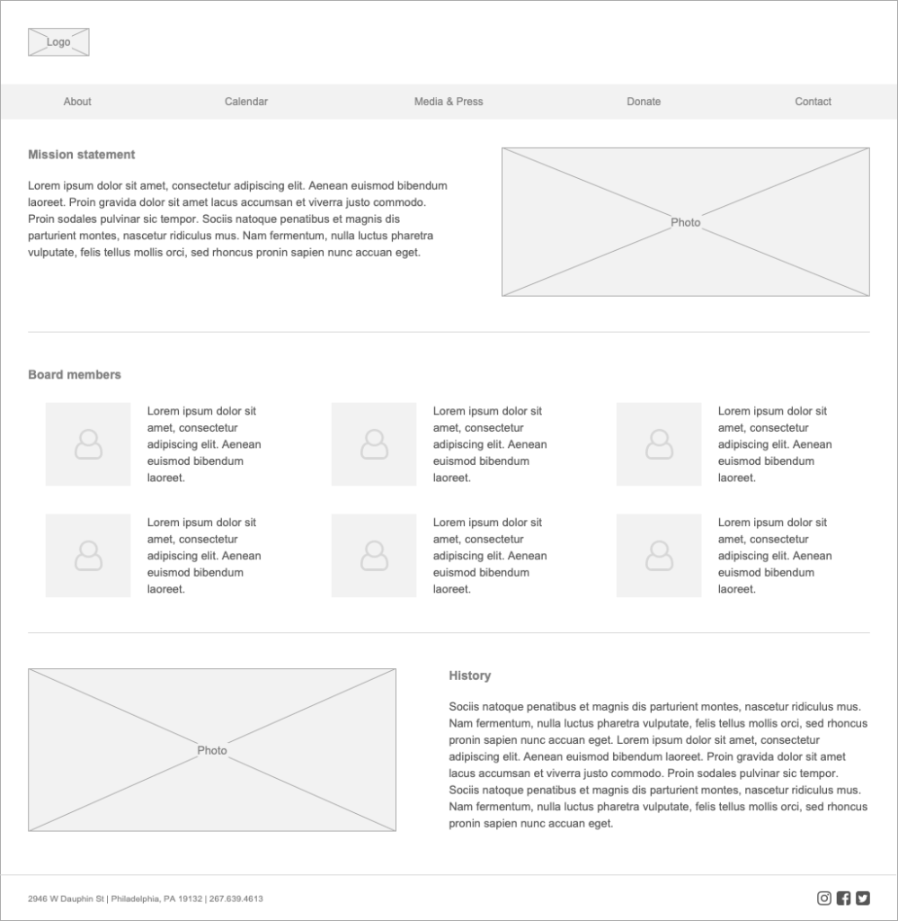
Wireframes

recommendation Summary
- Improve site navigation & IA to reflect priority items.
- Restructure site content for user friendliness and better SEO.
- Actionable information should be presented interactively instead of as a flyer.
- Include more links; avoid a dead-end page structure.
- Re-evaluate visual design to remedy instances of illegibility.
- Eg: Conflicting text & backgrounds, small font size, excessive transparency.
Next steps:
- Dedicate a team member to update content on a consistent basis, so that the website reflects what’s being promoted on the Facebook page.
- Acquire services from SEO specialists and web developers to start putting structural changes into action.

You must be logged in to post a comment.